Nexus x Android
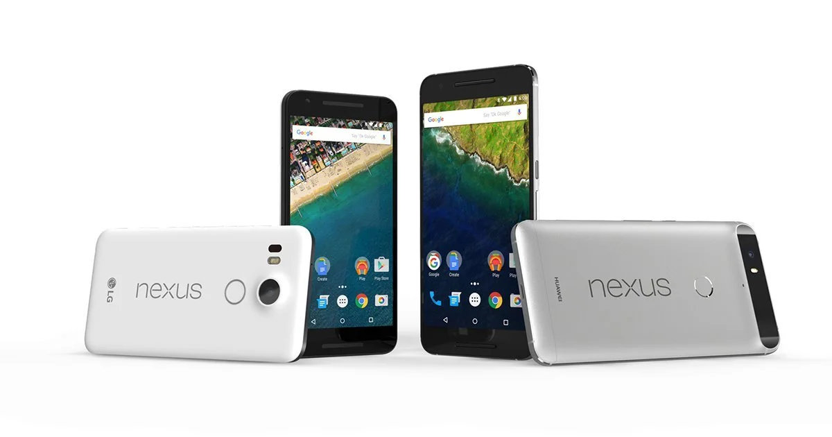
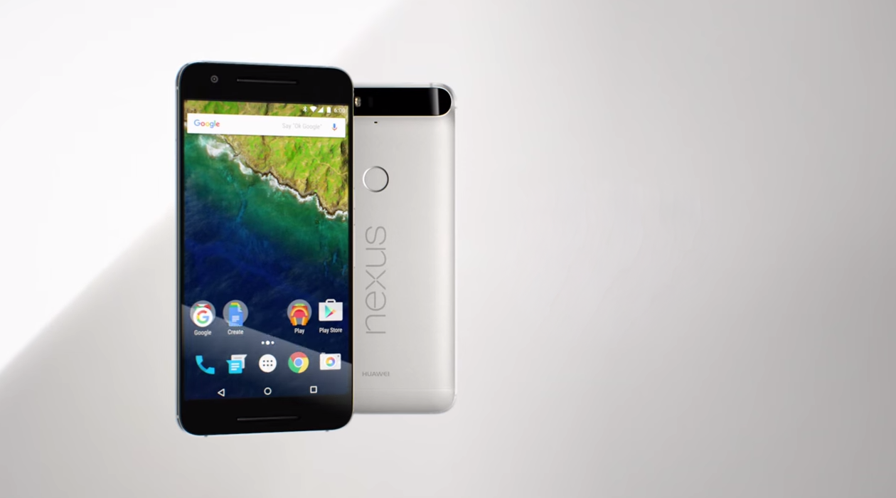
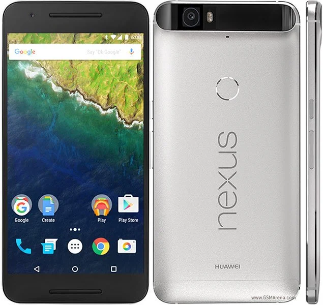
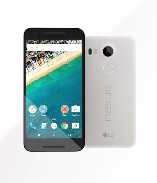
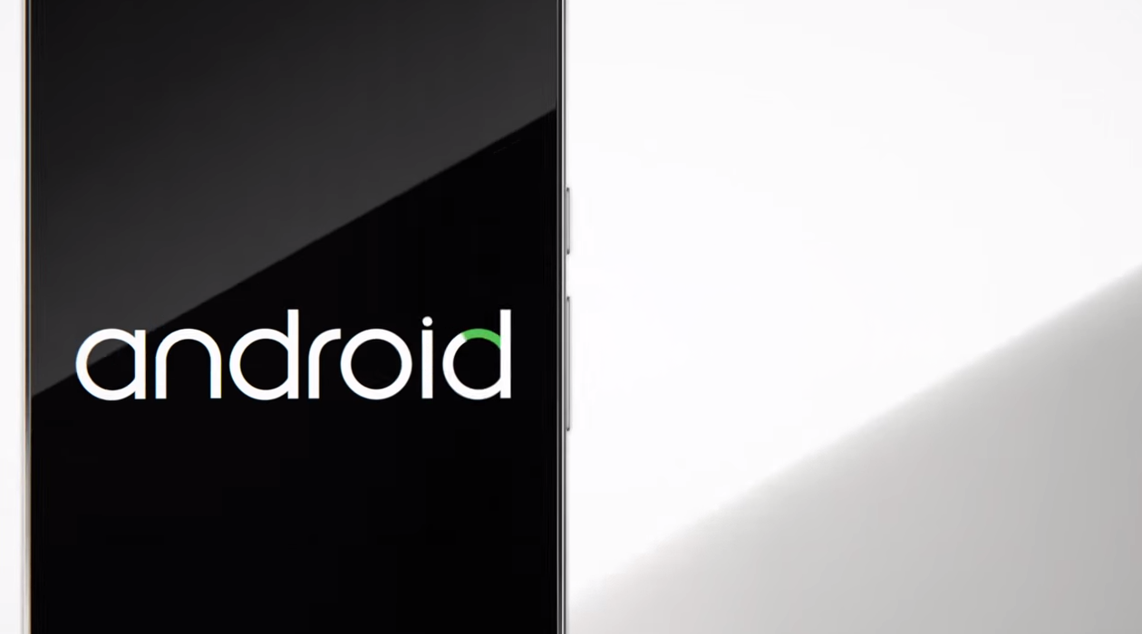
Google was making a serious push into the premium smartphone market. The Nexus was their flagship Android device — critically recognized as the true flagship of the Android ecosystem at launch, competing directly with Apple and Samsung for design-conscious consumers who expected both precision hardware and a clean software experience. The imagery had to match that ambition.
The creative problem was a familiar one. Apple and Samsung had already set the visual language for premium hardware. The ask was to find a way in that felt distinctly Google. We went to architecture.
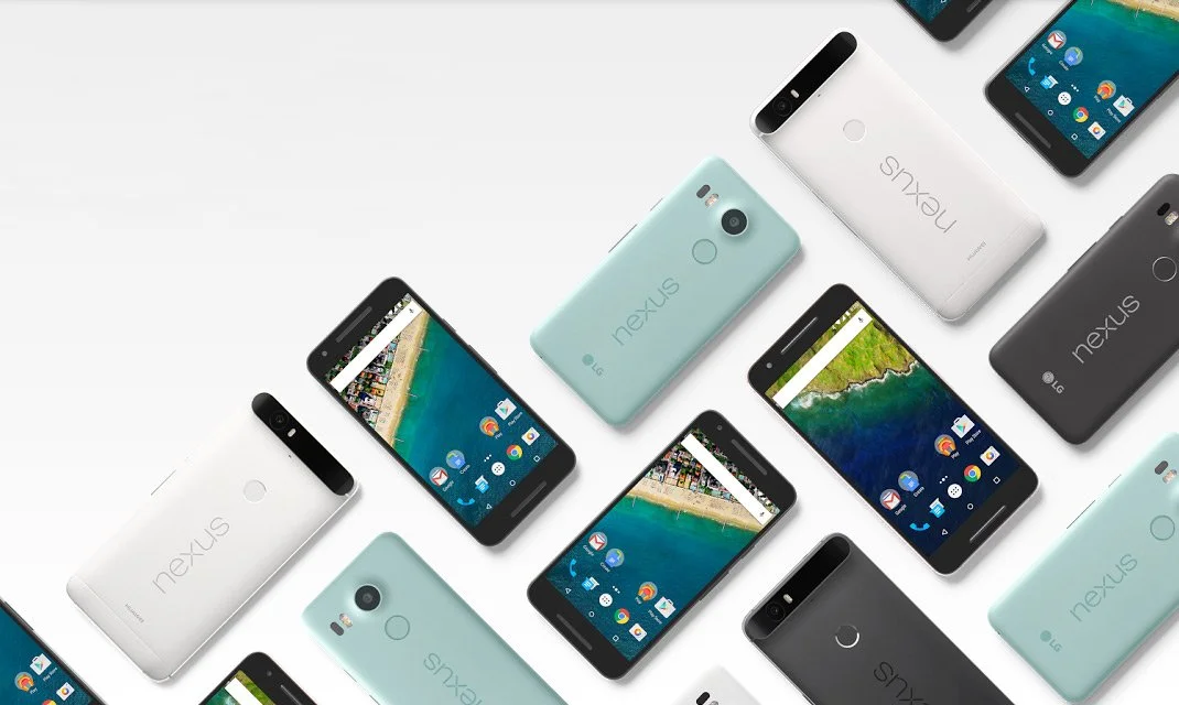
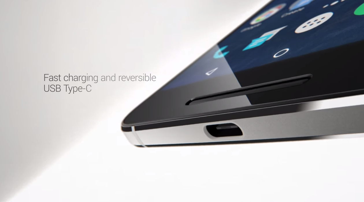
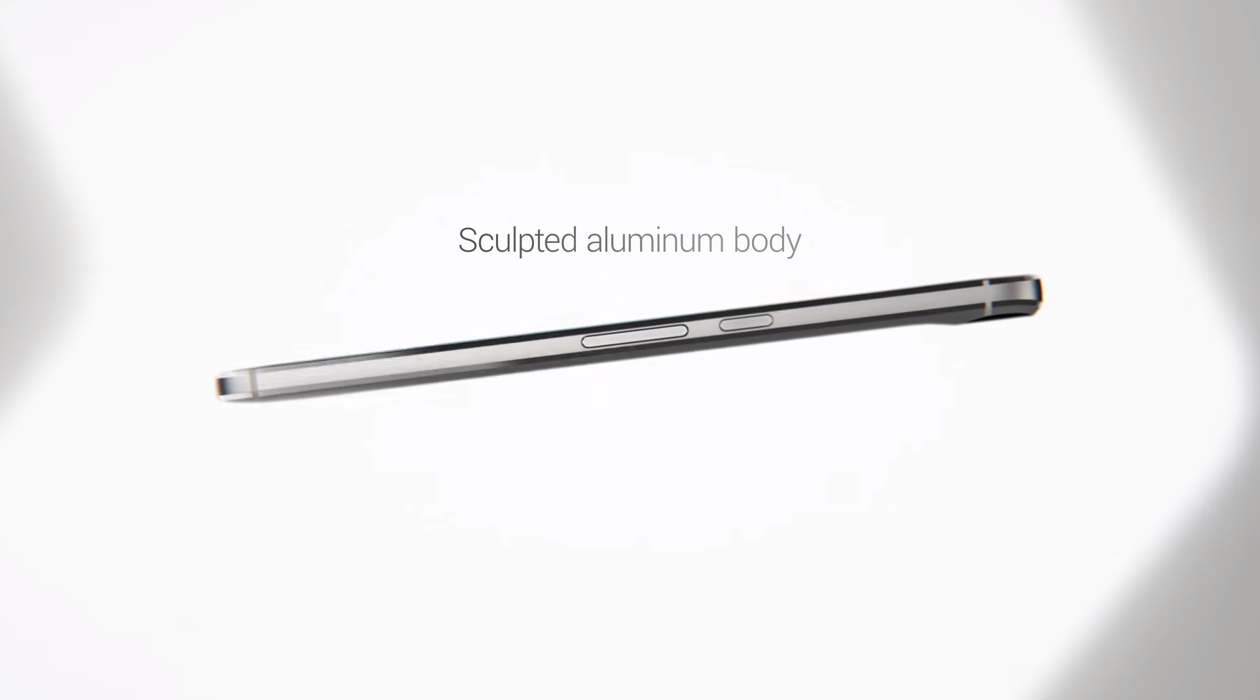
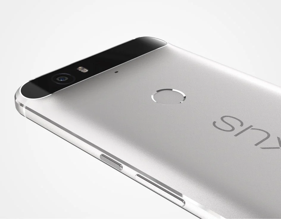
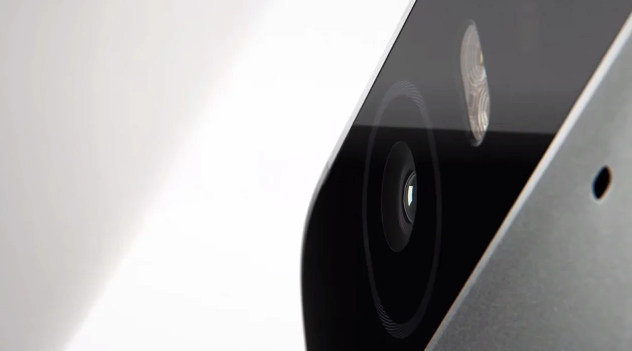
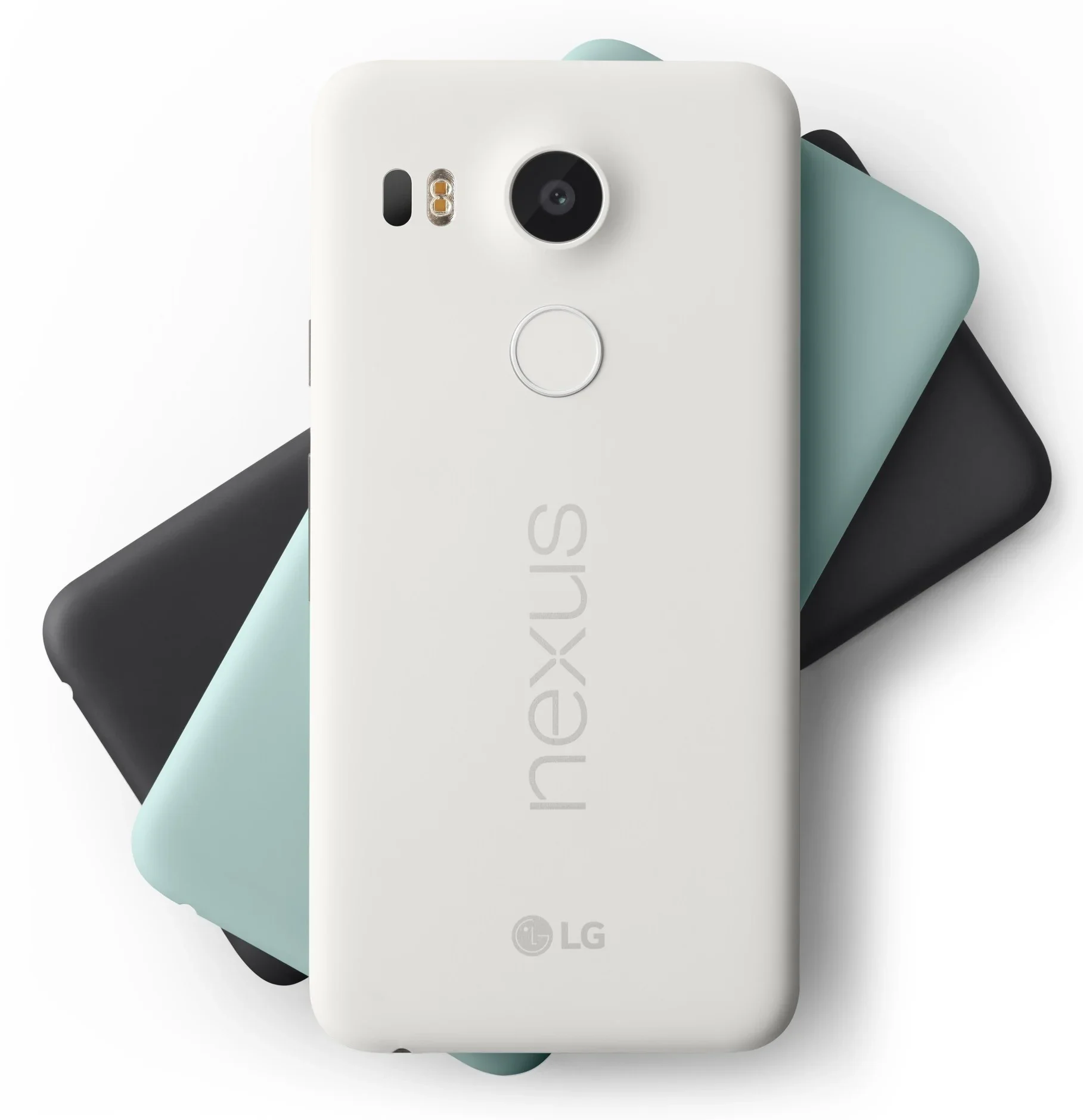
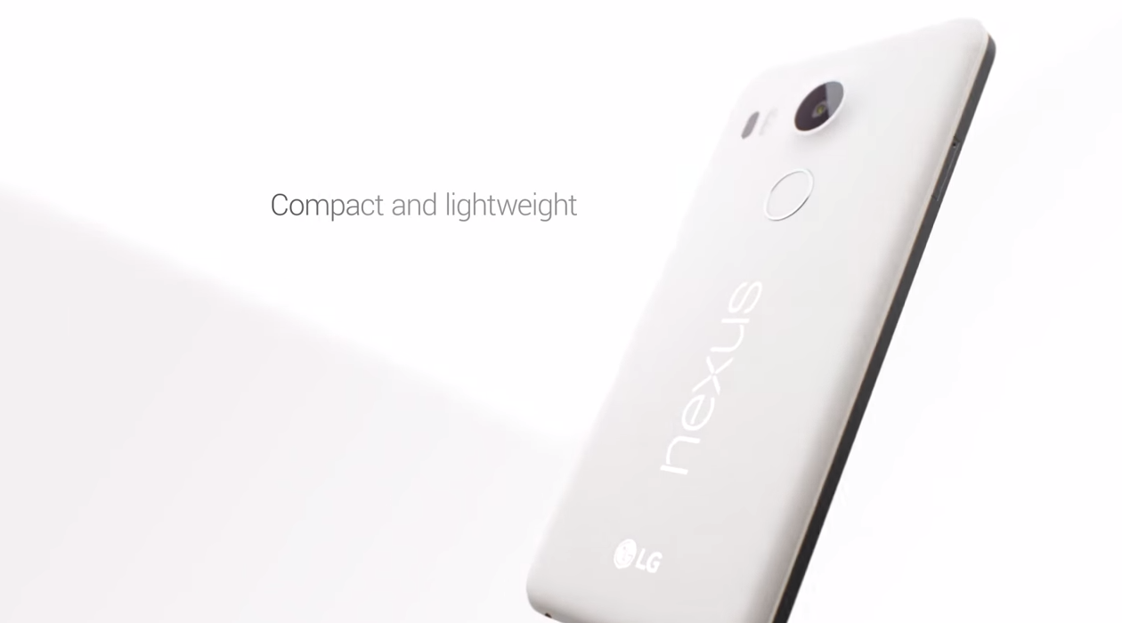
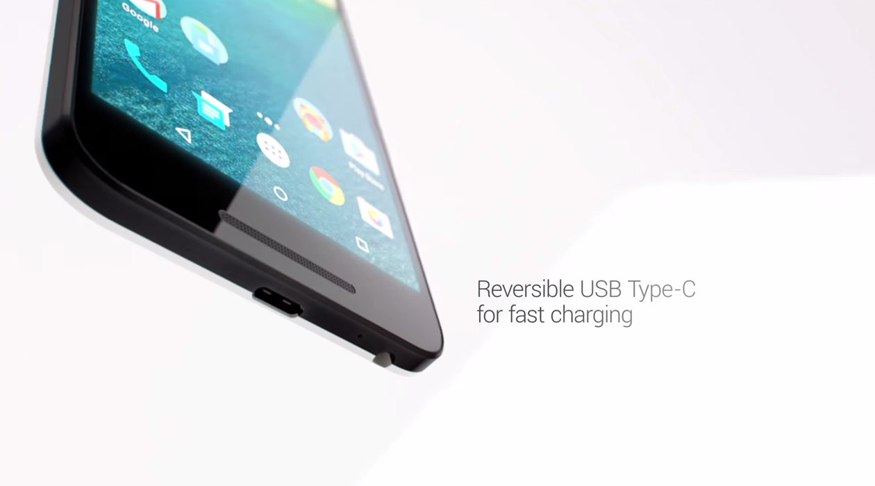
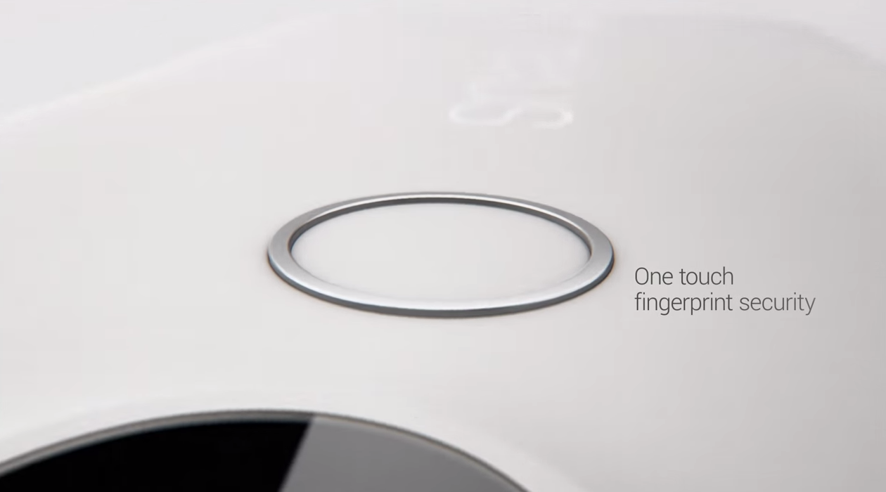
I led concept, art direction, and photography for the launch campaign, working in partnership with Google Creative Lab, LG's in-house creative team, and Sandbox Studios in San Francisco. The phones' design language — clean aluminum, geometric precision, strong material contrast — had more in common with a well-designed building than a consumer gadget, and I built the entire creative treatment around that idea. Brutalist reference imagery established the visual tone.
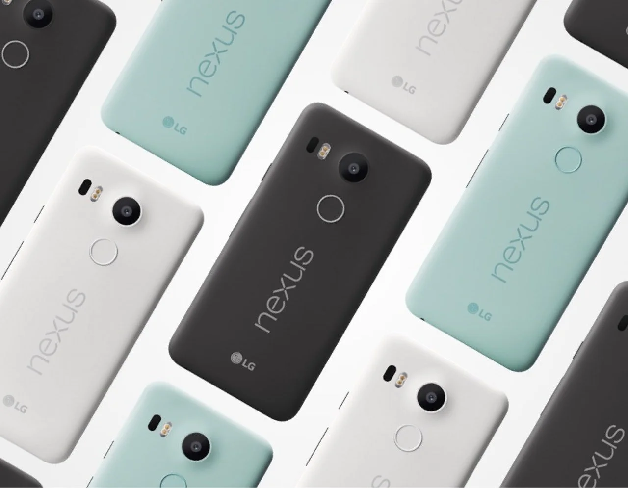
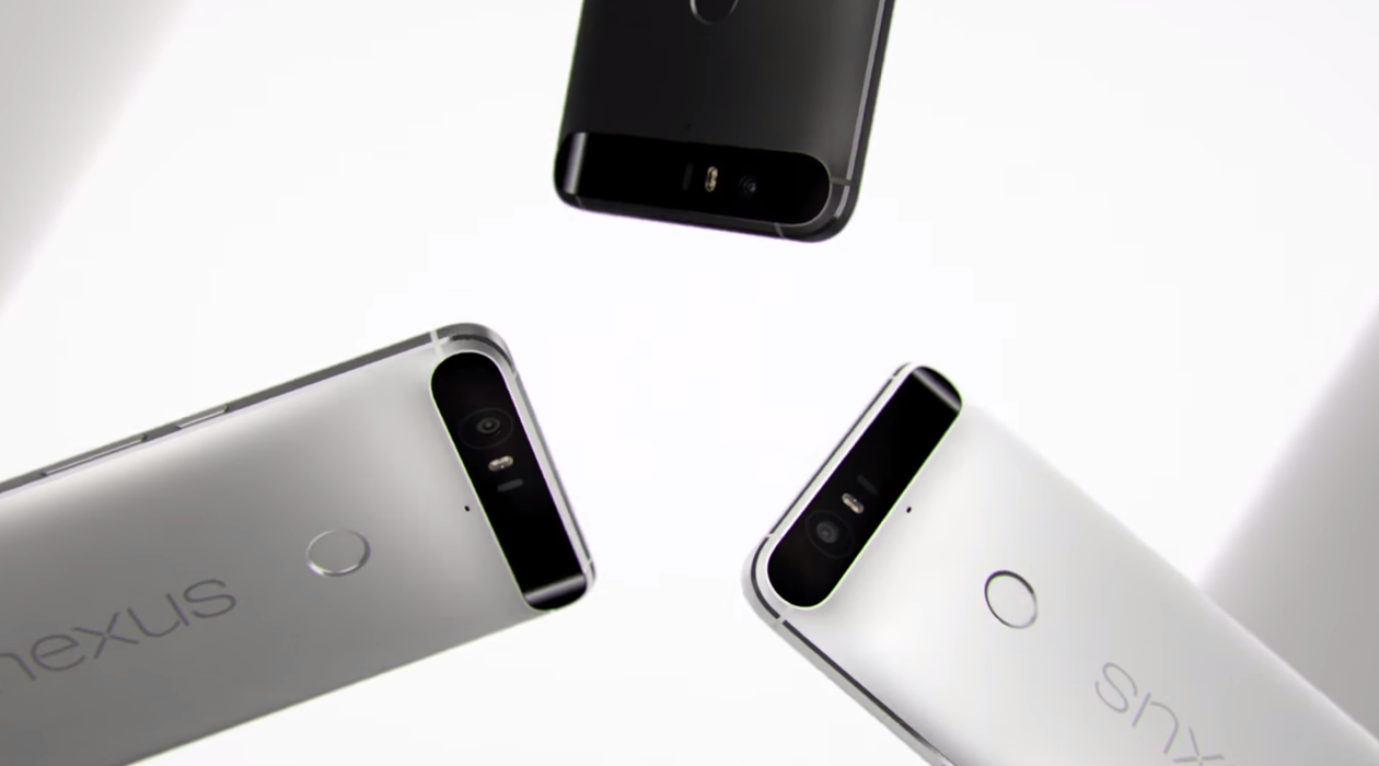
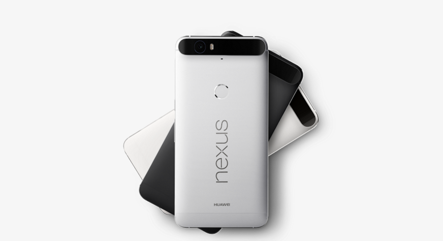
Deliberate negative space and monochromatic surfaces kept the phones as the only thing competing for attention. Compositional systems rooted in diagonal grid logic and modular repetition gave the work a visual rhythm that felt precise without feeling rigid. Simple, it turns out, is a full-time job.
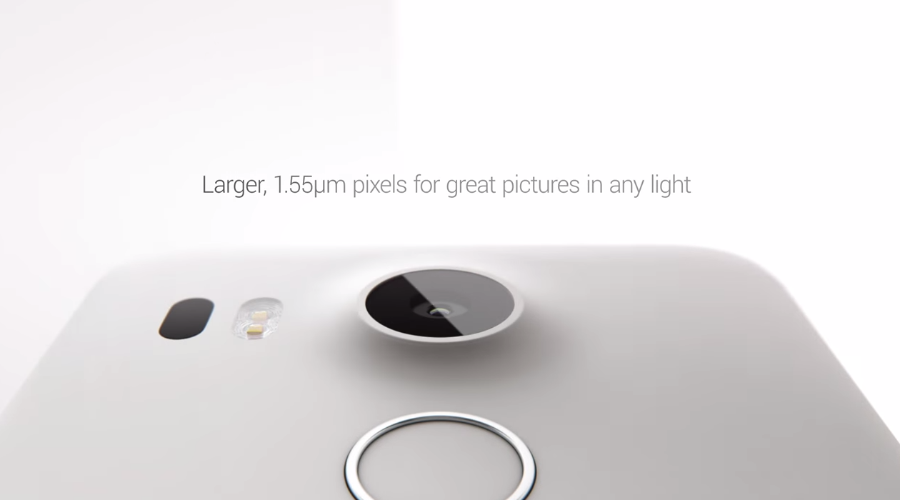
On set, I directed lighting design and shot composition across the full range of deliverables — making decisions that had to hold up across hero imagery, product gallery, and multi-platform social content simultaneously.
I worked closely with CGI and retouching vendors responsible for screen compositing and reflection cleanup, providing reference materials and on-set documentation to ensure the finishing work stayed consistent with the visual language established in camera.
The goal throughout was a system, not just a set of images — something that could scale across a hundred-plus assets without losing coherence.