
Instacart
Fresh Faster
Instacart had evolved well beyond its grocery delivery roots — serving consumers, retailers, and thousands of CPG brands across fresh produce, home goods, beauty, pharmacy, and beyond.
The visual challenge that came with that growth was specific: how do you make everyday objects feel immediate and craveable across a digital platform where attention is measured in fractions of a second.
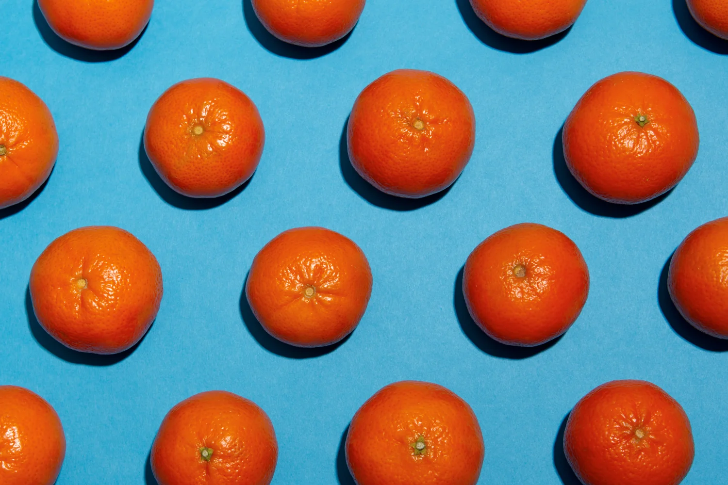
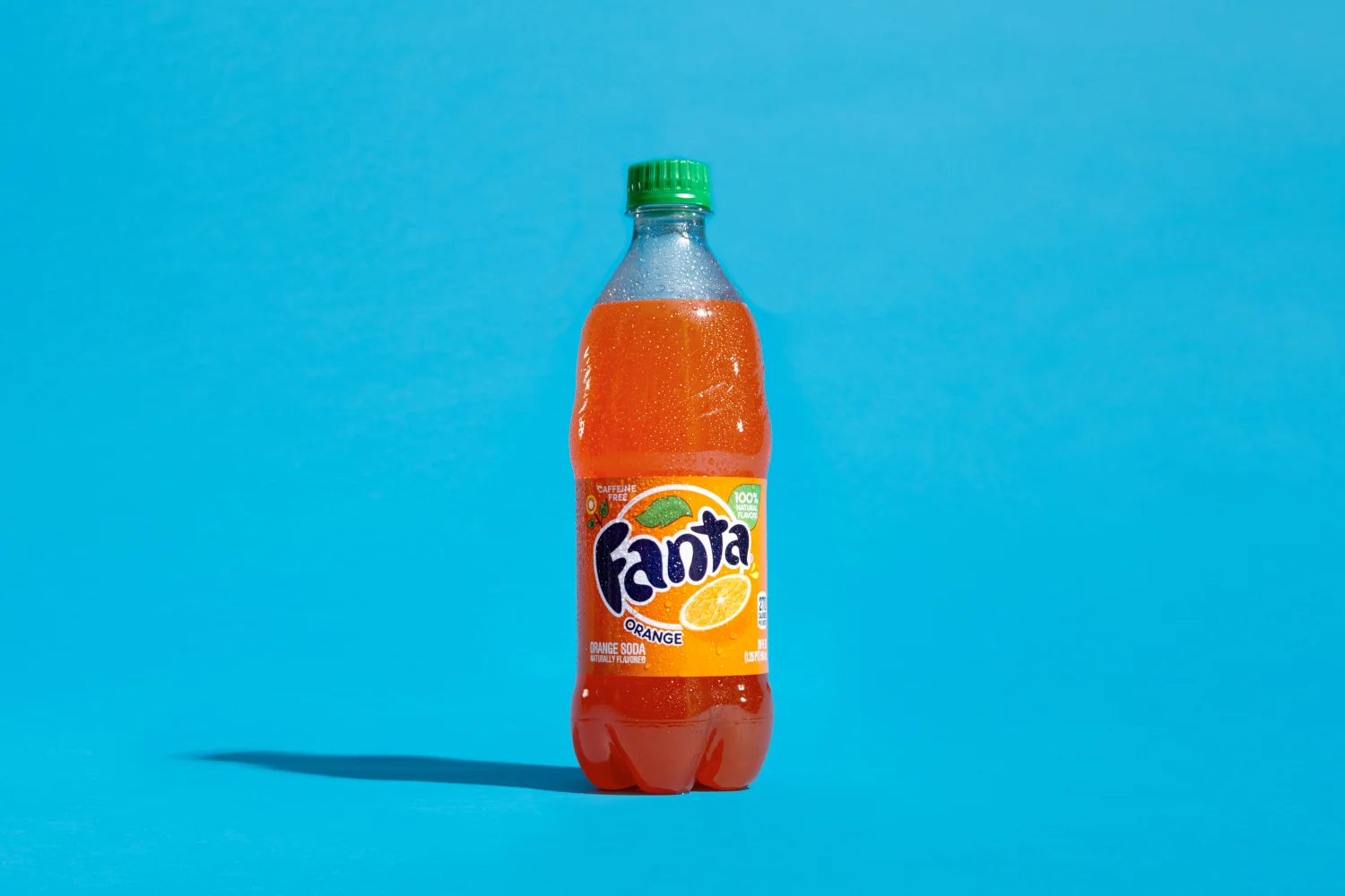
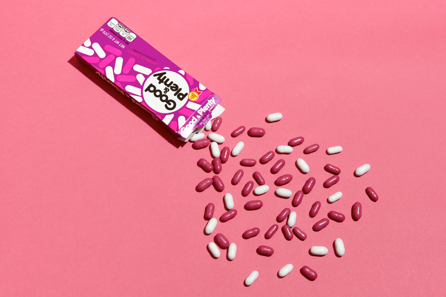
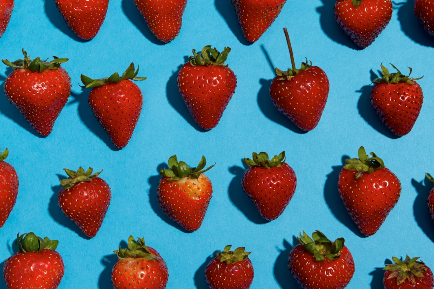
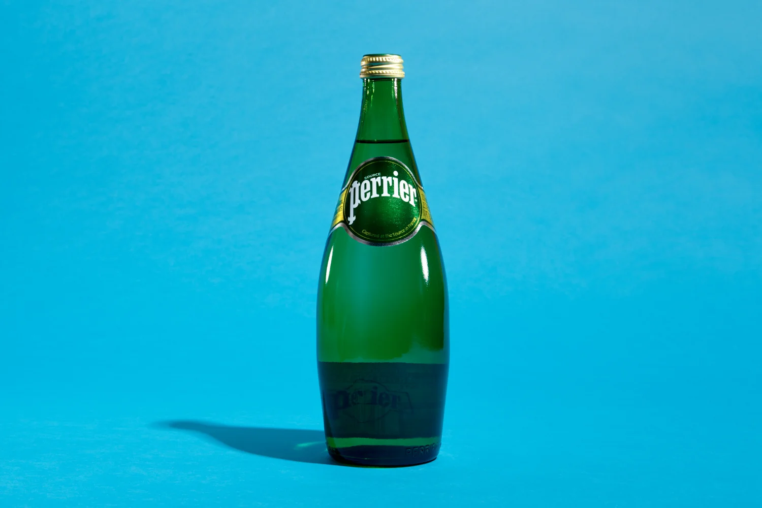
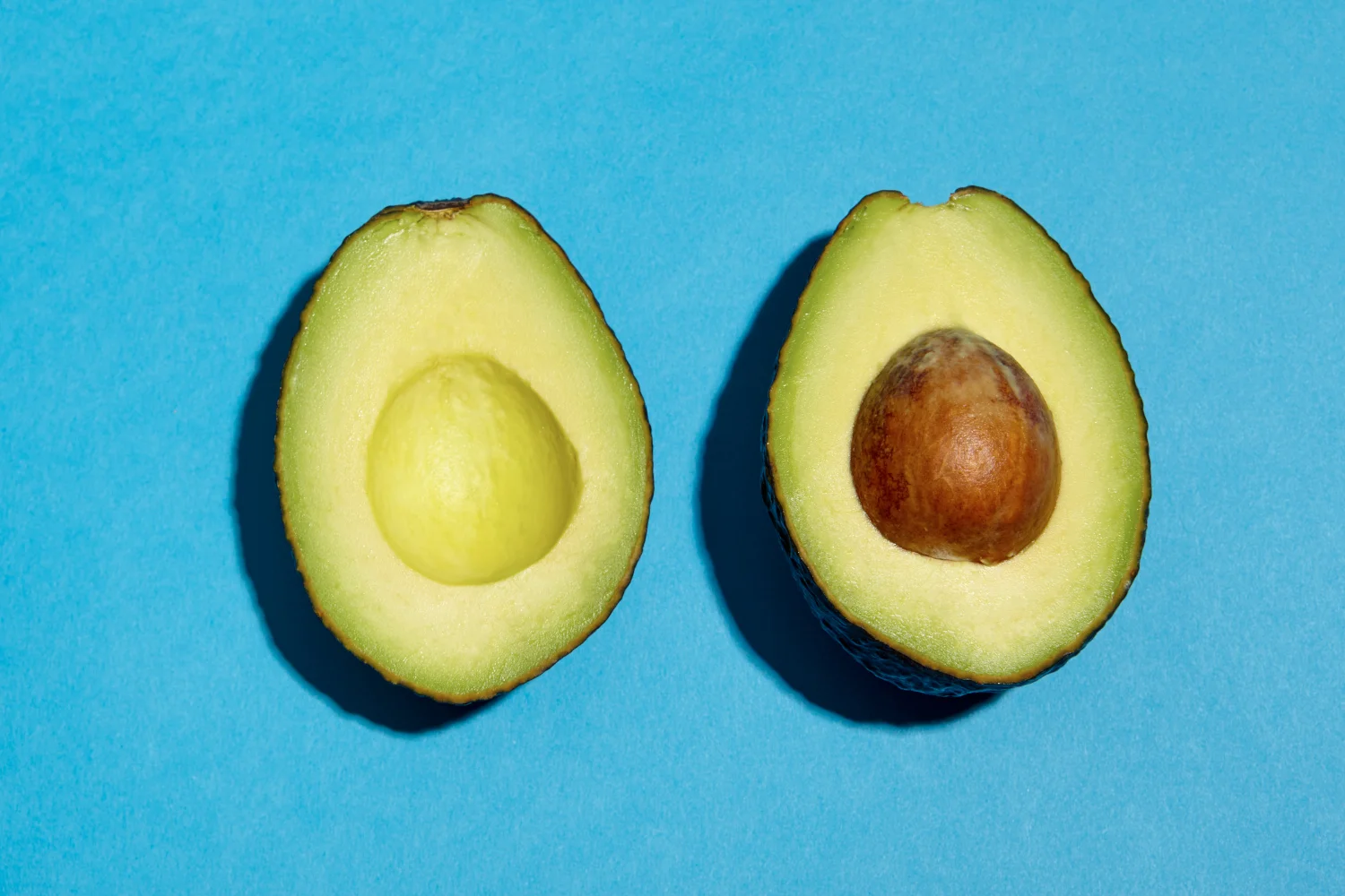
I led concept, art direction, photography, and styling for a series of feature images produced for Instacart's website refresh. The approach treated familiar grocery items with the same visual confidence typically reserved for hero products — saturated color fields, bold silhouettes, graphic composition — letting the inherent form of simple produce and pantry staples carry the work without environmental distraction.

Deliverables included homepage banners, category tiles, and mobile app feature placements.


Live placements across platforms.
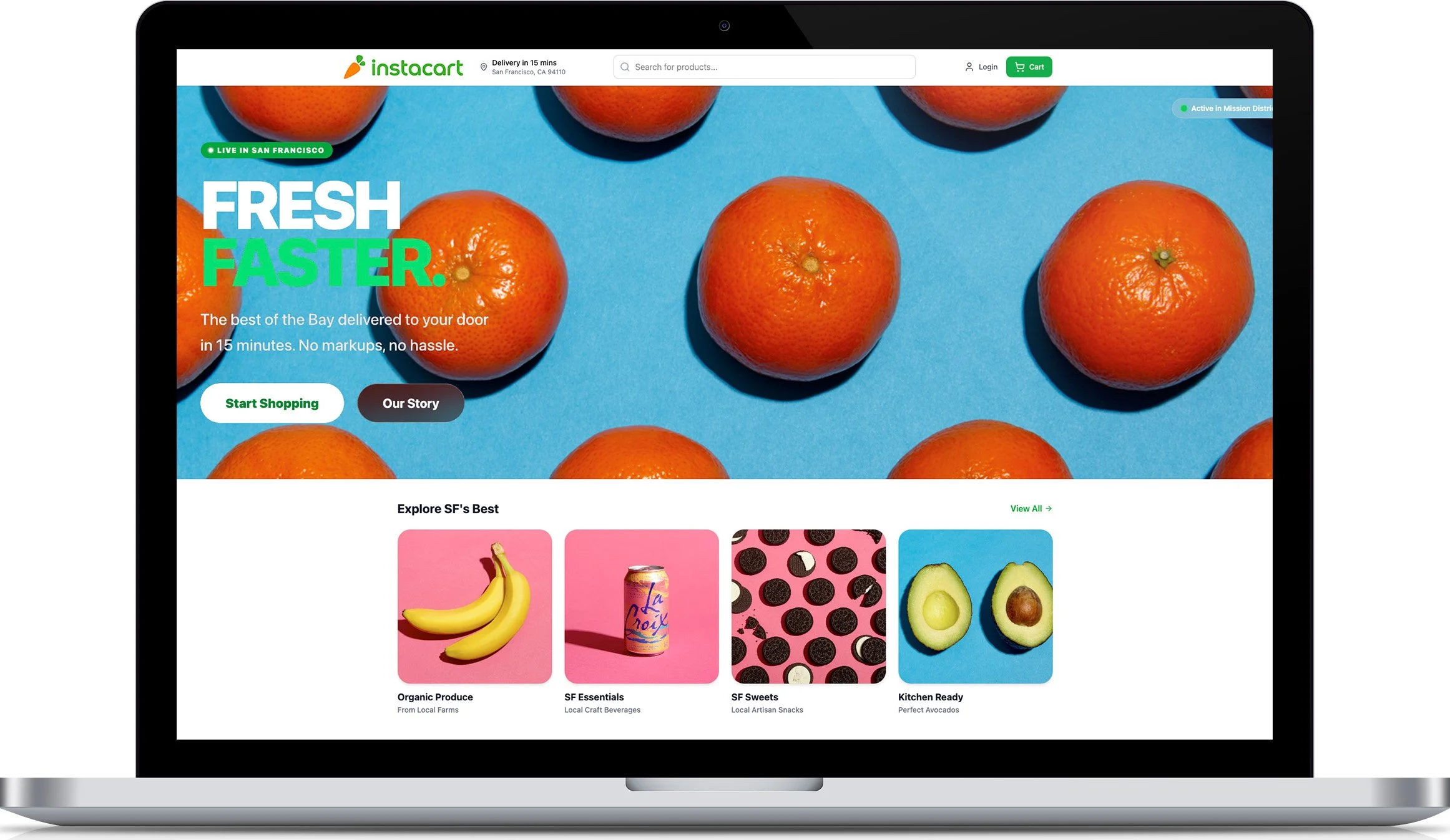
Homepage banner and category tiles.
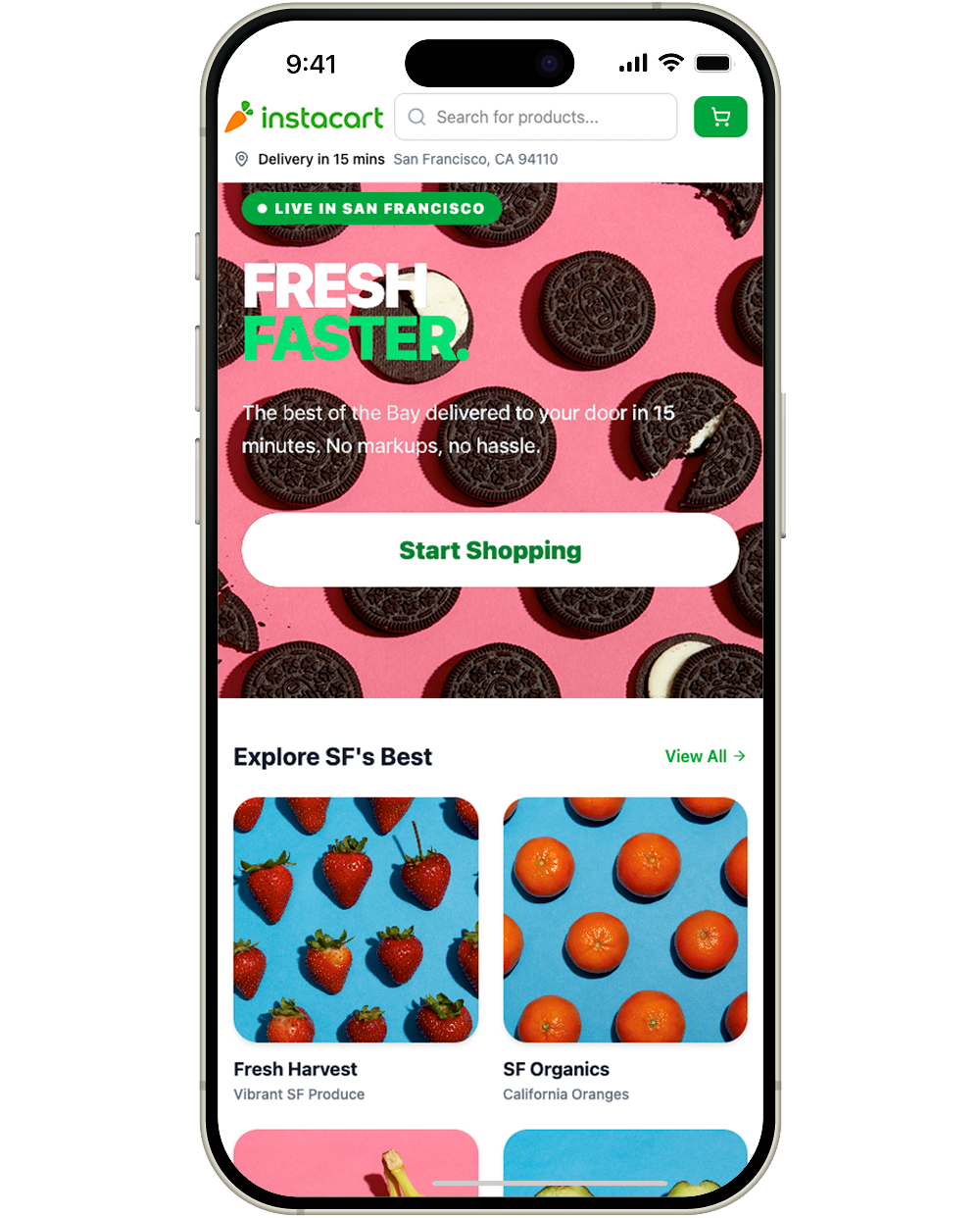
Mobile app feature placement.